Apple Keynote As a Design Tool
As a designer, getting new tools is second only to the love of creating something delightful for your audience. Recently, I’ve added a new tool to my arsenal, Apple’s presentation software, Keynote. There’s been quite a few people who have made the same realization, which is this: it’s a powerful tool for wireframing and creating digital assets. Let me show you some examples of where I’ve recently applied this tool.
Wireframing
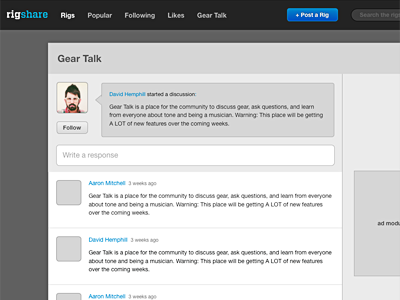
For low-fidelity wireframes, Keynote excels with its powerful shapes, vector tools, smart guides, master layouts, and pixel-level precision. I applied this on a recent wireframe I did for RigShare (link), the social guitar gear sharing site I’ve been building in my free time. I wanted to redesign our “Gear Talk” area, a place where musicians could ask questions, discuss gear, and generally just shoot the shoot. With Keynote, I was able to whip up a decent looking mockup rather quickly.
Hi-fidelity Comps
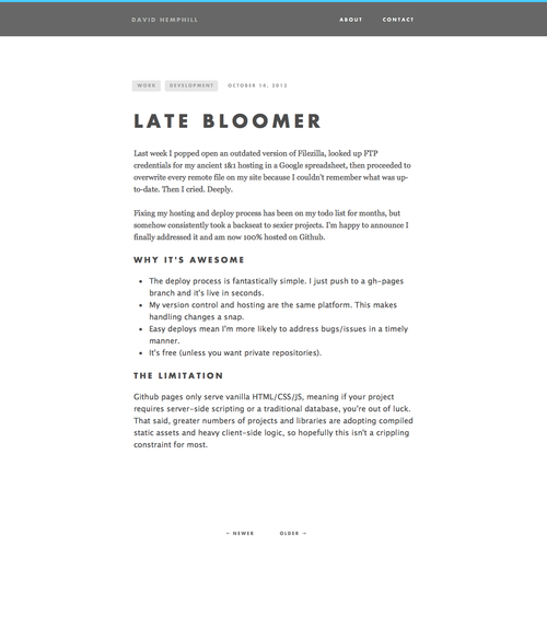
The most-recent, stripped down version of this site was comped entirely in Keynote. Granted, the design is not overly complex and any junior-level developer could code it out, but Keynote’s ease of use makes it a perfect candidate for this type of design work. Using Photoshop to mock up such a site would have taken me much longer, with the added danger of causing me to lose interest in the project.
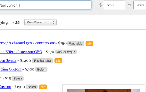
Another project’s design required me to make many new tag-like buttons, and I was able to use Keynote’s shape tools to create the right look and feel and paste them directly into Photoshop as vector smart objects. What a beautiful thing.
Simple Logos and Diagrams

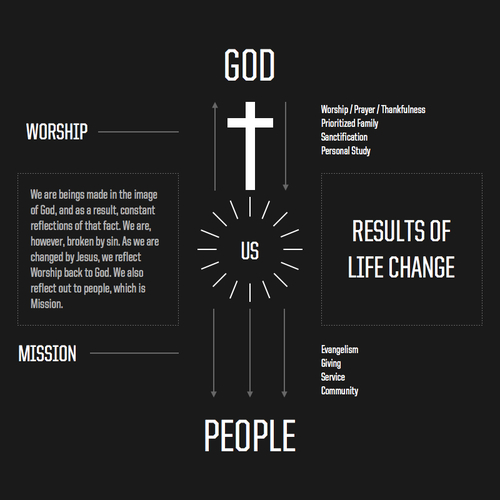
I was goofing around the other day, and wound up designing a logo for my band, Avapor, and used it to throw together imaginary album artwork. I also created a simple infographic. I was able to export both of these items as pdfs, which could then be inserted into Photoshop documents, edited with Illustrator, or mailed as-is.
Final Thoughts
There are a number of tools designers can use these days to get work done. Photoshop, Illustrator, Fireworks, etc… and even some new ones like Sketch that I’d like to try out. Whatever you use, it comes down to picking tools that help you get work done in the most creative, time-efficient manner and I’ve found Keynote to be a great asset in my production tool belt. Why not give it a try?
My love/hate relationship with notebooks

Designers and developers seem to have an unhealthy obsession with notebooks and writing utensils. I too share in this obsession. I have at least four notebooks I actively write in, with at least —- no joke —- seven sitting on a shelf, waiting to be used. I also buy too many pens that don’t get used because they feel weird or they don’t write smoothly enough.
As much as I love buying notebooks, I’ve found that using a notebook hasn’t come very natural for me. Staring at a white (or yellow) page with nothing on it causes anxiety not unlike what you feel when you start a design in Photoshop. It’s just blankness staring back at you.
How do you organize your notebook?
Despite my deep desire and understanding of the benefits of using a notebook, one of my key problems is figuring out a good way to organize all of my notes. There’s no order, no structure, and no sense to be made of a new notebook. It’s untapped power.
I did a quick search to see how others organize their notebooks. I found a few articles but have yet to find the system I think will work for me. I’m kind of at a loss on how to partition it so I can keep different project-related notes together.
Notebooks aren’t made for lefties
Besides the organization issue, I find that being a left-handed person inhibites my ability to use a notebook to its fullest. I know what you’re thinking, Whatever David, just use it upside down and quit your whining. True, I could use it upside down, but then the sewn-in bookmark strap won’t work as intended and it’s just plain awkward to use it that way. Drawing or writing with the spine inhibiting your hand or pushing your palm is just plain annoying.
My notes aren’t pretty enough
I think every designer/developer type wishes their notes were like those conference notes you see every year around SXSW and other conferences. Check this page from Joshua Blankenship:
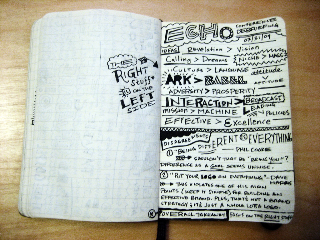
If you work in the web industry, you probably wish that your wireframes came out as neatly as the ones you see plastered all over Dribbble. I know I do.
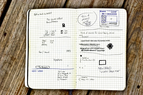
But they don’t. At their worst my notes are indistinguishable, at their median they usually wind up looking like this:
And at their best they look like this:
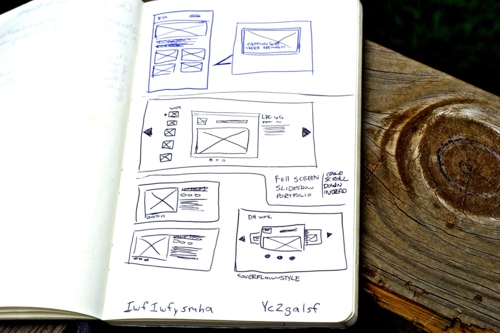
Not terribly beautiful are they?
What works for me
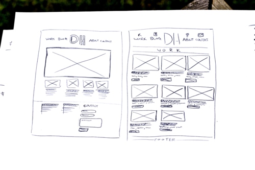
I like to work on plain ‘ole copy paper. It’s not very organized and it’s cumbersome, and I often lose sheets or the sheets get spilled on. But, while being a terrible way of doing notes, it’s the way I feel the most free to create and brainstorm. Often when I’m looking at a notebook I’m afraid I’ll “mess it up” and that it won’t “look cool”. This defeats the purpose. I’ve even made my own notebooks by stapling crappy paper together (come to think of it, that actually worked pretty well for me).
What I’m trying
So I definitely haven’t figured it all out yet, but what I’m trying to do is just get over myself and start using the dang thing and hoping it all comes together and I find the right system for me. If that happens, I will write my findings. For now, I guess I’m still on the road to finding the perfect solution for me.